Graphic Design II & III
  • Current Assignments
  • Course Expectations
  • Curriculum
    • Curriculum Map
  • Resources
  • Burlington High School Art & Design Program

Current Assignments

Marine Life Habitat

10/22/2020

0 Comments

 
Picture
​Project:
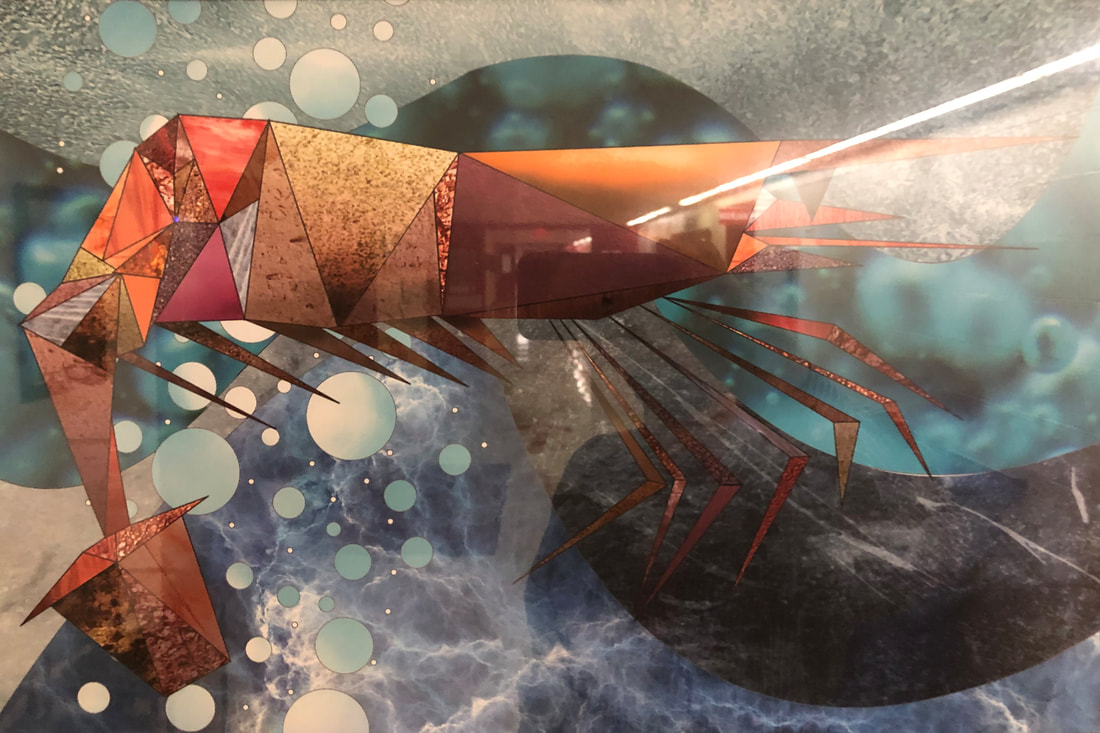
Design an appropriate habitat/environment for your marine life using ORGANIC shapes.

Be sure to keep the animal and environment on separate layers, as we will later be sharing the parts with one another in an animation project.

***DESIGN the page***
  • Consider Movement, Depth, Texture, Color
  • In the image above, note the differences in color and shape between the animal and environment.

Reference/Resource:
For ideas and inspiration, watch "My Octopus Teacher" on Netflix.

Reminders:
  • Textures: Use high-resolution, royalty-free images from stock photo sites.
  • Continue to imagine a light source from ABOVE.

Objectives:
  • Strong design
    • Organic v. Geometric Shapes
    • Repetition
    • Color Unity
  • Depth
  • Texture
  • Gradients, highlights, and shadows to create sense of light source

Tools you must use:
  • Pen Tool (Illustrator)
  • Paste Into
  • Blending Modes
  • Gradients
  • Image Adjustments (Color Balance, Hue/Saturation)

If working in Photopea or Photoshop for iPad:
In Photopea and Photoshop for iPad, there is no Paste Into. Textures must be put on a layer UNDERNEATH the drawing, then cut to fit the triangles.
0 Comments

Stylized Marine Life: Using Illustrator and Photoshop Together

10/7/2020

0 Comments

 
Picture
Project:
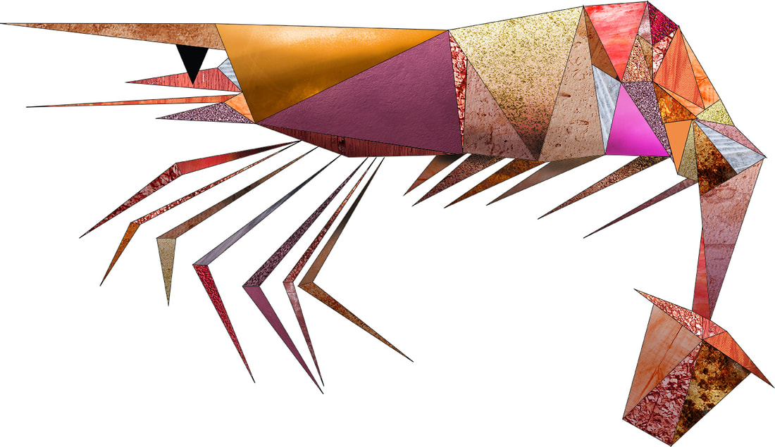
In Adobe Illustrator, using only triangles, create a specific, distinct, identifiable fish.
(Bass, trout, sunfish, etc.). Then, use Photoshop to incorporate texture and shadow.

(If you are unable to use Illustrator at home, you may do the project entirely in Photopea, or with a combination of the programs.)

First, look at the work of children's picture book illustrator Eric Carle (The Very Hungry Caterpillar), who worked in collage by cutting and pasting painted papers. You will be creating a digital collage by cutting and pasting virtual texture images.

Lesson (What are we learning by doing this project?):
  • Demonstrate the importance of research to good art-making -- Use appropriate visual references, but don't copy.
  • Less is More -- Use simple, basic shapes to make a complex thing; reduce a thing to its most essential elements.
  • Stylize to create visual interest -- Represent an identifiable, specific thing in a unique, artistic way to create more visual impact.
  • Skillfully edit images using basic photo-editing tools in Photoshop.
  • Skillfully use Illustrator and Photoshop together to take advantage of their differences.
  • Be able to locate and access royalty-free, high resolution images for better printing quality. Access stock image catalogs. Understand the meaning of copyright infringement.
  • Combine multiple photo files.
  • Use texture and shadow to enrich a graphic image.

Process (Follow these steps:)

1. Collect a series of photographs of a specific marine animal, preferably one with scales or other clear divisions/shapes, from different angles/viewpoints.

2. On paper, sketch the animal multiple times. Get to know the basic forms of the animal. What makes this animal distinctive from others?

3. Think of ways to stylize the animal, to make it more "designed", rather than strictly observational, while still clearly being that specific animal.

4. On paper, draft a stylized version of the animal using triangles.

5. In Illustrator, draw using only triangles.
  • Save as an Illustrator EPS to your desktop with the file name "Fish yourlastname.eps"

6. Open the EPS file in Photoshop:
  • Resolution: 300 pixels/inch (ppi)
  • Image Size: to fit 13 x 19 inche rectangle
  • Color Mode: RGB
  • Immediately save it as as Photoshop Document with the file name "Fish yourlastname.psd"

7. Search for and download large (high-resolution) royalty-free image files of textures (approx. 2000 x 3000 pixels) to your desktop.from a stock image resources such as https://freestocktextures.com

8. Open those texture files in Photoshop and modify the textures to match the colors you want for each part of the fish:
  • Go to Image - Adjustments, then use:
  • Color Balance, Hue/Saturation, and Levels (which will adjust the contrast of the image).

9. Add textures to your drawing:
  • On your fish PSD file, use the Magic Wand tool to select parts of your fish, one triangle at a time.
  • In the texture file, Select All, then Copy
  • In the fish file, "Paste Special -- Paste Into" each selected triangle of your fish, one triangle at a time. Adjust the texture as needed once you have pasted it (Go to Edit - Transform, then Scale or Rotate. You can also move each texture within its triangle using the Move Tool (black arrowhead in your Toolbox).

10. Using the Gradient Tool, the Burn Tool, and the Dodge Tool in Photoshop, add tonal value (lights and darks) to each triangle to create a more three-dimensional form on the fish.

11. Remove the background layer, so only the fish is visible, and save as a PNG file. This will be a flat, web-safe version of the image that preserves the transparency of its background. As a group, we can combine these images into a single composition.


Checklist and Self-Assessment:
  • Is your artwork easily identifiable as a specific type of fish? What makes it so, or what would make it so?
  • Is it unique, artistic, and stylized; or more of a realistic representation? What could you have done to make it more stylized, more designed rather than copied?
  • Is your artwork in the proper format (300 ppi, RGB, 13 x 19", .psd and .png)? Is it in a resolution that will be good for printing at a large size? Have you preserved the transparent background?
  • Did you use all of the following Photoshop tools? Which do you feel you mastered? Which did you struggle with?:
    • Paste Into,
    • Color Balance,
    • Hue/Saturation,
    • Levels,
    • Transform (Scale, Rotate),
    • Move,
    • Gradient Tool,
    • Burn Tool,
    • Dodge Tool.
  • Do you have a sense of how Illustrator and Photoshop differ? Describe some advantages of each program. Describe some of the challenges.
  • Do you know why we need to use royalty-free, high resolution images? Well, why?
  • Did you use texture and shadow to enrich your image. Does your fish look three-dimensional?

Grading Criteria:
  • Design (Visual Impact)
  • Technical Quality
  • Personal Investment
Studio Habits of Mind Rubric

Extension Question:
What are some possible uses for the graphic artwork you have created? Who might be the audience for such an image? Why do you say that? What might be added to these images to give them a specific purpose?
0 Comments

Pre-Assessment: School Signage

9/20/2020

0 Comments

 
Assignment:
Using either Photoshop, Illustrator, Photopea*, or a combination, create signage for three of the school subject areas/departments. *Try Photopea for at least one poster. You will do at least one while in class and one while working at home using two or three different programs if you choose.

Requirements:
  • The subject/department should be dominant and easy to read.
  • Visually convey meaning. Communicate the subject.
  • Use the entire picture plane. Fill it up.
  • Must have depth.
  • Show off your skills. Impress us with what you already know how to do.

Dimensions:
  • 12” high x 18” wide
  • Resolution (if Photoshop or Photopea): 300 ppi
  • Color Mode: CMYK

In class, you will each be assigned three of the departments/subjects below, so that every subject has a sign and there is minimal overlap:
  • Administration & Department Heads
  • Art & Design
  • Athletics
  • Bridge Program
  • Business
  • Counseling
  • English
  • English Language Learning
  • Family & Consumer Science
  • Health & Wellness
  • Social Studies
  • Library & Technology
  • Mathematics
  • Performing Arts
  • World Languages
  • Science
  • Food Services

Steps:
  1. Go to photopea.com to access the program.
  2. If working at home on Photopea, watch this 20 minute YouTube video tutorial on Photopea for Beginners: https://youtu.be/4pfdGEnFtUU
  3. Check the helpful hints in getting started with the program on this page: https://www.photopea.com/learn/
  4. In Photopea, go to New File
  5. Set the proper dimensions (12 x 18”), resolution (300 ppi), and color mode (RGB).
  6. Save immediately as filename “school subject yourlastname.file extension (either PSD or EPS)”.
  7. Work in layers.
  8. Show off your skills
  9. Save regularly.
  10. Create a Google Drive folder entitled “Computer Graphics II yourlastname”
  11. At the end of every session, turn in a JPG or screenshot of your progress.*
  12. When completed, place the PSD or EPS file in the Google Drive folder and share with Mr. Ratkevich

*When you are working remotely, as an “exit ticket” at the end of every class, you are expected to turn in visual documentation of your progress. To do this, at the beginning and end of every remote session, take before-and-after screenshots of your work (or save JPG versions of your work) and send them to Mr. Ratkevich via Google Classroom or email.

Next: During Wednesday’s remote-only class, we will take a look at everyone’s initial work, talk about the experience of working with Photopea, and address any questions or problems that came up.

Grading Criteria
  • Creativity
  • Content (Development and communication of ideas)
  • Design
  • Technical Quality (“Finished”)
  • Studio Work Habits

This is a pre-assessment to find out what you already know, and I will be observing work habits and your process, your final work, and your participation in the final critique of student work. By observing how you approach the project, I will gain a better sense of your strengths and of how you might grow throughout the year.

As the assessment tool, we will be using this rubric:
Rubric: Art Studio Habits of Mind
0 Comments

Art Exhibition Poster

2/12/2020

0 Comments

 
Project:
Poster for 47th Annual Art Exhibition

Client:
Art & Design Department

Format:
Size: Super B (13 x 19”)
Orientation: Portrait (vertical)
Created in: Illustrator and/or Photoshop
If Photoshop, resolution must be 300 pixels/inch or greater

Must Include:
Annual Art Exhibition
art@bhs logo *
“Exhibition” logo/graphic* (optional)
* (You will find these logos/graphics in the shared Google Drive).

Opening Reception of the Student Art Exhibition
Thursday, March 20th, 2014
6:30 - 8:30 pm

Burlington High School
123 Cambridge Street
Burlington, MA 01803


Grading Criteria:
Organization and Readability
Strength of Design (Visual Impact)
Technical Quality / Craftsmanship / Presentation
Creativity
Work Habits
0 Comments

Self Promotional Flyer

9/3/2019

0 Comments

 
Background:

We need to advertise ourselves and what we can offer the school and community. Teachers don't know that we are here; they don't know what they can get from us and our services. Now is our chance to show off. 


Assignment:

Create a "fun" self-portrait vector drawing to be used to advertise to teachers and to the community. We will print these out on paper and give them out. Play with the shapes of your face and also the colors. Play with the shapes in the background. Use bold colors and large shapes. Use the elements of art and principles of design.

Text to include:

Hi! My name is ......
Let me tell you about DIGITAL PUBLISHING at BHS
One sentence about the Digital Publishing Team (i.e. The Digital Publishing Team is a .....)
Here is what we do:
(List these services) Posters, Websites, Infographics, Advertisements, Publications, and more
List the website: 


Steps:

Find a high-res photo of yourself
Trace your photo using the pen tool
Embellish yourself using exaggerated colors and shapes


Objectives:

Analyze vector drawings and utilize the skills used to create them
Study typography in order to use it in your ad
Study marketing techniques to distribute flyers and advertise services of a design-like agency


Vocabulary:

Vector
Resolution
Self-Portrait
Pop Art


Grading Criteria:

Artistic Expression and Creativity Rubric

Concept/Expressiveness
What sets yours apart from other vector illustrations?
Aesthetics/Design (Visual Impact)
In what ways did you use the tools in Illustrator to make 
    your design a dynamic composition while using 
    the elements and principles?
Technical Quality
In what ways did you use the pen tool?
Participation/Personal Investment
How did you work during class? 


Artists to Consider:

Andy Warhol
Roy Lichtenstein
Alexy Oglushevich
Read this article about Oglushevich to understand how he works with vectors.


Checklist:

Is it a good LIKENESS?
Did you use variations in tonal value (SHADING)?
Did you use an interesting and cohesive COLOR SCHEME?
Did you use CONTRAST to add visual impact and make all parts easy to see and read?
Did you use REPETITION by using the same typeface (font), the same font sizes, the same colors, and the same spacing between elements?
Did you ALIGN all the elements?
Is the design BALANCED?
Are your SPELLING and GRAMMAR correct?
Did you use the art@bhs logo?

​
0 Comments
Forward>>

    Author

    Write something about yourself. No need to be fancy, just an overview.

    Archives

    April 2022
    May 2021
    April 2021
    March 2021
    February 2021
    January 2021
    November 2020
    October 2020
    September 2020
    February 2020
    September 2019

    Categories

    All

    RSS Feed

Powered by Create your own unique website with customizable templates.